The Complete AI Image Prompt Guide Built from 300 Design Evaluations
A systematic YAML 7-Part Structure for AI image prompts, derived from analyzing 300+ infographic design evaluations in Banana X. Includes high-scoring patterns and domain-specific templates.
Introduction: Stop Settling for “Just Pretty” Images
Ever typed “modern clean blog hero image” into an AI image generator? The result was probably a bland, generic image you’ve seen a thousand times. When your prompt is vague, the AI produces vague images.
To solve this, we analyzed 300+ infographic designs evaluated across 5 criteria in the Banana X project. The result? High-scoring designs share clear, consistent patterns — and we distilled those patterns into a systematic prompt framework called the YAML 7-Part Structure.
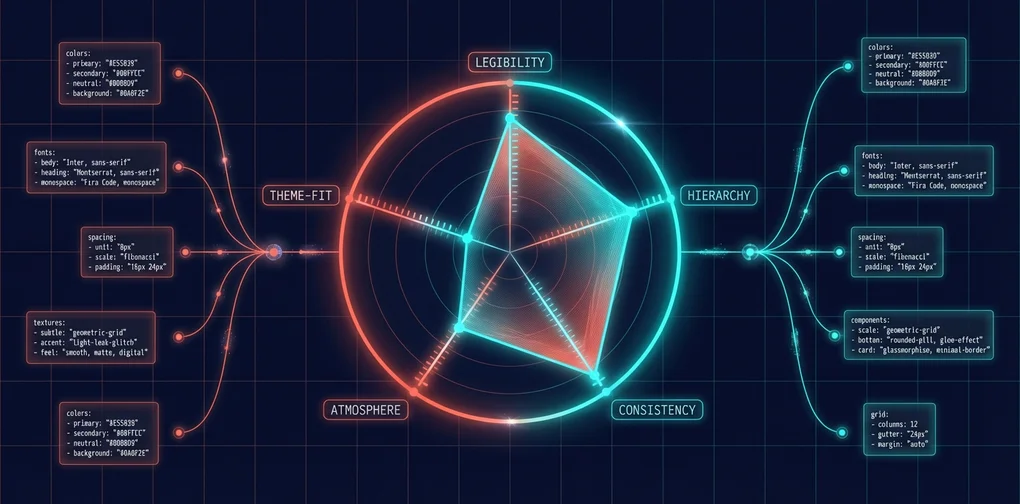
The 5 Evaluation Criteria (50 Points Total)
| Criterion | Points | Description |
|---|---|---|
| Legibility | 10 | Can the information be clearly read? |
| Hierarchy | 10 | Is the visual priority of information distinguishable? |
| Consistency | 10 | Do all design elements follow a unified grammar? |
| Atmosphere | 10 | Does the style reinforce the content’s meaning? |
| Theme Fit | 10 | Does the visual match the post’s topic? |
By extracting the common traits of designs scoring 45+ out of 50, we created a prompt writing framework anyone can follow.
1. YAML 7-Part Structure: The Skeleton of a Great Prompt
Every image prompt must include these 7 elements. Let’s walk through each part with BAD vs GOOD examples.
Part 1: Tone — 5 Mood Keywords
Tone: "keyword1, keyword2, keyword3, keyword4, keyword5"Define the entire world of your image with 5 adjectives or nouns. The more specific, the better.
❌ BAD:
Tone: "modern, clean, professional"→ Applies to literally every design. Zero directional guidance for the AI.
✅ GOOD:
Tone: "intellectual, planned, precise, engineering, blueprint"→ “An intellectual, precisely engineered blueprint” — a clear visual world emerges.
High-Scoring (45+) Tone Patterns:
| Style | Tone Keywords |
|---|---|
| Minimal/Line Art | simple, refined, silence, mode, mature |
| Blueprint/Technical | intellectual, planned, precise, engineering, blueprint |
| Paper Craft | warm, handcrafted, storybook, dimensional |
| Neumorphism | futuristic, clean, soft, UI, minimal |
| Cyberpunk/Circuit | stark, grid, network, future, intelligence |
| Newspaper/Classic | journalism, gravity, classic, authority, impact |
Part 2: Visual Identity — Color Palette
Visual Identity:
  Background: "#HEX (Color Name) — role description"
  Text Color: "#HEX (Color Name)"
  Accent Colors:
    - "#HEX (Name) — purpose"
    - "#HEX (Name) — purpose"
When specifying colors, always include both the HEX code and the color name. This ensures the AI interprets colors accurately.
❌ BAD:
Visual Identity:
  Background: "blue"
  Accent Colors:
    - "yellow"
→ “Blue” could mean anything from navy to sky blue. The AI has to guess.
✅ GOOD:
Visual Identity:
  Background: "#0047AB (Cobalt Blue) — blueprint background"
  Text Color: "#FFFFFF (White)"
  Accent Colors:
    - "#FFD700 (Gold) — key highlights"
    - "#ADD8E6 (Light Blue) — auxiliary lines"
→ Precise color codes + roles keep the AI’s color scheme consistent.
High-Scoring Color Combinations:
| Style | Background | Text | Accent |
|---|---|---|---|
| Blueprint | #0047AB (Blue) | #FFFFFF (White) | #FFD700 (Yellow) |
| Minimal | #FFFFFF (White) | #000000 (Black) | #D3D3D3 (Light Gray) |
| Art Deco | #050505 (Rich Black) | #D4AF37 (Gold) | #C0C0C0 (Silver) |
| Cyberpunk | #000033 (Dark Blue) | #00FFFF (Cyan) | #1E90FF (Dodger Blue) |
| Paper Craft | Pastel tones | Cut-out style | Complementary pastels |
Part 3: Image Style — Core Visual Approach
This part determines what the image actually looks like. It consists of 5–6 sub-fields.
Image Style:
  Features: "Core visual approach in one sentence"
  Shapes: "Shapes and motifs to use"
  Texture: "Surface texture"
  Composition: "Layout and framing"
  Effects: "Visual effects" (optional)
  Imagery: "Specific image elements" (optional)
BAD vs GOOD for each field:
Features — The most important single sentence:
- ❌
"Clean modern design"→ Matches every design ever - ✅
"Layout composed of PCB circuit board patterns"→ Unique to this design
Shapes — Recurring visual elements:
- ❌
"Various shapes"→ Zero information - ✅
"Straight lines and 45-degree traces, nodes, connectors"→ Concrete visual vocabulary
Texture — Tactile expression:
- ❌
"Smooth"→ Insufficient - ✅
"Washi paper fibers, woodblock grain, ink gradations"→ Physical presence
Composition — Visual hierarchy strategy:
- ❌
"Centered layout"→ Too simple - ✅
"A few thin lines in the center of overwhelming white space"→ Includes spatial strategy
Part 4: Typography — Font Style
Typography:
  Heading: "Heading font style"
  Body: "Body font style" (optional)
  Style: "How the font is applied"
❌ BAD:
Typography:
  Heading: "Sans-serif"
✅ GOOD:
Typography:
  Heading: "Drafting stencil font"
  Style: "Hand-drawn block letters, placed like dimension lines and annotation labels"
High-Scoring Typography Patterns:
| Style | Heading | Style |
|---|---|---|
| Blueprint | Drafting stencil font | Hand-drawn block letters |
| Minimal | Thin sans-serif (Light/Thin) | Thin enough to feel spacious even at large sizes |
| Neumorphism | Rounded sans-serif | Embossed/debossed like button labels |
| Paper Craft | Cut-out letters, rounded fonts | Letters that look cut from paper |
| Newspaper | Blackletter (masthead style) | Tightly set type |
Part 5: Content Connection — Linking to Post Content
Content Connection:
  Core Concept: "The key concept this post covers"
  Visual Metaphor: "What metaphor visualizes the concept"
  Key Elements: "2-3 core visual elements extracted from the post"
This is the most important differentiator. Without this section, you’ll get a generic image that could belong to any post.
❌ BAD (No Content Connection): → A “React” post’s hero image could just as easily be used for a “Vue” post
✅ GOOD:
Content Connection:
  Core Concept: "Component separation between server and client to reduce bundle size"
  Visual Metaphor: "A building (app) splitting into server floors and client floors as an architectural blueprint"
  Key Elements: "Server zone (blue), client zone (green), data flow arrows"
→ An image direction that only makes sense for a “React Server Components” post
Part 6: Constraints — Non-Negotiables
Constraints: "No text overlay. No watermarks. 2:1 aspect ratio. No photorealistic human faces."4 mandatory constraints you must always include:
| Constraint | Reason |
|---|---|
No text overlay | AI-generated text is almost always garbled |
No watermarks | Prevents watermark artifacts |
2:1 aspect ratio | Blog hero image ratio |
No photorealistic human faces | Avoids uncanny valley faces |
Part 7: Self-Check — 3-Point Validation
After writing your prompt, verify these 3 things:
- Uniqueness Test: “Could this prompt be used for a completely different post?” → If yes, Content Connection is lacking
- Visual Specificity Test: “Would two people reading this prompt draw similar images?” → If no, Shapes/Texture/Composition need work
- Consistency Test: “Do the 5 Tone keywords conflict with the Color Palette + Image Style?” → If there’s a conflict, revise
2. The Common Laws of High-Scoring Designs
Here are the shared traits of designs scoring 45+ out of 50 across 300 evaluations.
The Secret to Consistency 10/10: Unified “Design Grammar”
Designs that achieved perfect consistency scores apply the same design grammar to every element:
- Line weight is uniform throughout
- Icon abstraction levels are consistent
- Color usage follows rules (e.g., red = emphasis, blue = supporting)
- Texture is synchronized across all areas
How to achieve this in your prompt:
# ❌ BAD: No texture description → AI uses different textures for each part
Image Style:
  Features: "Modern design with icons"

# ✅ GOOD: Explicit texture rules for the entire image
Image Style:
  Features: "Composed entirely of uniform ultra-thin lines"
  Texture: "All lines at identical weight (0.5pt equivalent)"
  Composition: "Unified abstraction level for all symbols"
The Secret to Atmosphere 10/10: Style as “Container for Information”
Perfect atmosphere scores go to designs where the style isn’t mere decoration — it reinforces the content’s meaning. The design should shift the reader’s emotional state.
| Score | Pattern | Why It Scores High |
|---|---|---|
| 50/50 | Minimal/Line Art | Masterful understanding of information through subtraction |
| 49/50 | Blueprint/Technical | Perfect metaphor of “thought as architectural plan” |
| 49/50 | Paper Cutout | Paper depth physically represents information layers |
| 49/50 | Neumorphism | Emboss/deboss physically represents priority levels |
The Secret to Theme Fit 10/10: Repurposing a Style’s Essence
The key is understanding a style’s core essence and applying it to information expression:
- Blueprint → Uses the “design/planning” metaphor to express the information construction process
- Newspaper → Uses the “journalism” format to emphasize information gravity
- Ukiyo-e → Uses the aesthetic of “refined elegance” to elevate information dignity
Analyzing Perfect Score (50/50) Designs
What all 50/50 designs have in common:
- 100% commitment to one style — No style mixing
- Specific Content Connection — 1:1 correspondence with the post content
- Strict constraint compliance — No text overlay, exact ratio
- Tone ↔ Style ↔ Color triangular consistency — All three point to the same visual world
3. Domain-Specific Prompt Templates
Here are prompt templates optimized for 5 technical domains. Each defines a visual language suited to its domain — just fill in the Content Connection for your specific post.
3.1 Web Development / Frontend
Tone: "modern, constructive, layered, component, clean"
Visual Identity:
  Background: "#FFFFFF (White)"
  Text Color: "#1A1A1A (Near Black)"
  Accent Colors:
    - "#61DAFB (React Blue) — framework signature color"
    - "#F7DF1E (JavaScript Yellow) — supporting"
Image Style:
  Features: "Architectural composition of stacking component blocks"
  Shapes: "Rounded rectangles, connection lines, nested structures"
  Texture: "Flat, clean digital surface"
  Composition: "Left-to-right data flow, or component tree"
Typography:
  Heading: "Modern sans-serif (Inter, SF Pro)"
  Style: "Monospace accents like a code editor"
Constraints: "No text overlay. No watermarks. 2:1 aspect ratio."
Key idea: Stacking component blocks in an architectural composition to express frontend’s “assembly” nature.
3.2 AI / Machine Learning
Tone: "intelligence, network, future, glow, neural"
Visual Identity:
  Background: "#0A0A2E (Deep Space Blue)"
  Text Color: "#E0E0FF (Light Lavender)"
  Accent Colors:
    - "#00FFCC (Cyan Glow) — neural connections"
    - "#FF6B6B (Coral) — data points"
Image Style:
  Features: "Abstract representation of neural network nodes and connections"
  Shapes: "Glowing spherical nodes, curved connection lines, data streams"
  Texture: "Luminous particles floating in dark space"
  Composition: "Central hub with radially expanding network"
  Effects: "Glow effects, subtle bokeh"
Typography:
  Heading: "Thin futuristic sans-serif (Exo, Audiowide)"
  Style: "Glowing text"
Constraints: "No text overlay. No watermarks. 2:1 aspect ratio."
Key idea: Glowing node networks against deep space blue — visualizing AI/ML’s essence of “connection and learning.”
3.3 DevOps / Infrastructure
Tone: "design, precision, planning, intellectual, industrial"
Visual Identity:
  Background: "#0047AB (Blueprint Blue)"
  Text Color: "#FFFFFF (White)"
  Accent Colors:
    - "#FFD700 (Yellow) — highlights"
    - "#ADD8E6 (Light Blue) — auxiliary lines"
Image Style:
  Features: "Architectural blueprint aesthetic"
  Shapes: "Grid squares, dimension lines, cross-sections, arrows"
  Texture: "Photosensitive paper, drafting paper"
  Composition: "Strict grid-based, organized information density"
Typography:
  Heading: "Drafting lettering (Architect's Daughter style)"
  Style: "All caps, disciplined placement"
Constraints: "No text overlay. No watermarks. 2:1 aspect ratio."
Key idea: Blueprint aesthetic — expressing DevOps’ “infrastructure design” essence through architectural drawings.
3.4 Performance / Optimization
Tone: "speed, efficiency, lightweight, refined, optimization"
Visual Identity:
  Background: "#FFFFFF (White)"
  Text Color: "#000000 (Black)"
  Accent Colors:
    - "#00C853 (Success Green) — post-optimization"
    - "#FF5252 (Error Red) — pre-optimization"
Image Style:
  Features: "Minimalism stripped to the absolute essentials"
  Shapes: "Ultra-thin lines, geometric shapes, graph curves"
  Texture: "Matte and smooth"
  Composition: "Overwhelming whitespace, before/after contrast"
Typography:
  Heading: "Thin sans-serif (Light / Thin)"
  Style: "Numbers large, everything else restrained"
Constraints: "No text overlay. No watermarks. 2:1 aspect ratio."
Key idea: Extreme minimalism — expressing “optimization = removing the unnecessary” through whitespace.
3.5 Security
Tone: "robust, trust, layers, protection, encryption"
Visual Identity:
  Background: "#0F0F0F (Almost Black)"
  Text Color: "#00FF00 (Terminal Green)"
  Accent Colors:
    - "#FF0000 (Alert Red) — threats"
    - "#00BFFF (Cyan) — protection layers"
Image Style:
  Features: "PCB circuit board and encryption metaphor"
  Shapes: "Shields, keys, locks, multi-layered concentric circles"
  Texture: "Dark metallic surface, faint circuit patterns"
  Composition: "Central protected asset surrounded by multiple layers"
  Effects: "Faint scanline sweep"
Typography:
  Heading: "Monospace (Fira Code)"
  Style: "Terminal output display"
Constraints: "No text overlay. No watermarks. 2:1 aspect ratio."
Key idea: Dark background + terminal green — expressing security’s “defense in depth” essence with concentric layers.
4. Converting YAML → English Prompts
To feed your YAML-structured prompt into an AI image generation API, you need to convert it into an English natural language prompt.
Conversion Rules
| YAML Part | Position in English Prompt | Conversion Method |
|---|---|---|
| Tone | Opening phrase | "A [tone1], [tone2] illustration..." |
| Visual Identity | Color specification | "...in [color1] (#HEX) and [color2] (#HEX)..." |
| Image Style | Core description | Compress Features + Shapes + Texture into 1–2 sentences |
| Composition | Layout direction | "...with [layout description]..." |
| Content Connection | Metaphor description | Visual Metaphor as the key sentence |
| Constraints | End of prompt | "No text overlay. No watermarks. 2:1 aspect ratio." |
Conversion Template
A [Tone keywords] illustration of [Features description].
[Shapes description] arranged in [Composition description].
[Texture description] with [Effects if any].
Color palette: [Background] background, [Accent colors] for key elements.
[Typography style if relevant to the visual].
[Content Connection: Visual Metaphor].
No text overlay. No watermarks. Suitable for 2:1 aspect ratio blog hero image.
Full Example: Next.js App Router Migration
YAML Design:
Tone: "constructive, modern, migration, evolution, architecture"

Visual Identity:
  Background: "#FFFFFF (White) — clean architectural drawing"
  Text Color: "#000000 (Black)"
  Accent Colors:
    - "#0070F3 (Next.js Blue) — new App Router side"
    - "#999999 (Gray) — old Pages Router side"
    - "#00C853 (Green) — success/improvement arrows"

Image Style:
  Features: "Like an architectural renovation, showing migration from old to new structure via blueprints"
  Shapes: "Left: old floor plan (Pages Router), Right: new floor plan (App Router), Center: transformation arrow"
  Texture: "Grid paper, fine drafting lines"
  Composition: "Left-right split. Left = old (gray tones), Right = new (blue tones), large arrow in center"
  Effects: "Right side with subtle glow"

Content Connection:
  Core Concept: "Incremental migration from Pages Router to App Router"
  Visual Metaphor: "An architect renovating an old building with a new floor plan"
  Key Elements: "Gray blueprint of old structure, blue blueprint of new structure, green migration arrows"

Constraints: "No text overlay. No watermarks. 2:1 aspect ratio. Blueprint aesthetic."
Converted English Prompt:
An architectural blueprint illustration showing migration from old to new
structure. Left side in gray shows a legacy floor plan (Pages Router), right
side in Next.js blue (#0070F3) shows a modern floor plan (App Router). A large
green arrow connects them through the center. Grid paper background with fine
drafting lines. Left half is muted gray tones, right half is bright blue tones
with subtle glow. Technical annotation style labels. Clean, architectural,
precise. No text overlay. No watermarks. 2:1 aspect ratio.
The key is compressing everything from your YAML structure into natural language without losing any important details.
Conclusion: Results and Final Checklist
Real-World Blog Application Results
After applying this guideline to actual blog hero image generation:
- Before: Prompt “modern tech blog hero” → generic gradient image seen everywhere
- After: YAML 7-Part Structure applied → a unique image perfectly aligned with the post content
The Content Connection part alone boosted Theme Fit scores from an average of 6 to 9 out of 10.
Final Checklist
After completing your prompt, run through this checklist:
- Tone: Are the 5 keywords specific and mutually consistent?
- Visual Identity: Are HEX codes + color names + purposes all specified?
- Image Style: Are Features/Shapes/Texture/Composition each specific enough?
- Typography: Is a style-appropriate font specified?
- Content Connection: Is the visual metaphor meaningful only for this specific post?
- Constraints: Are the 4 mandatory constraints (text, watermarks, ratio, faces) included?
- Self-Check 3 Points: Did it pass the uniqueness / visual specificity / consistency tests?
Follow this structure, and AI will generate high-quality hero images that perfectly match your blog posts. Stop settling for “just pretty.” Use data-proven high-scoring patterns to create precise, meaningful images.
Was this helpful?
Your support helps me create better content. Buy me a coffee.
Related Articles
-
jangwook.net 45-Day Growth Report: 7 Insights from 750 Visitors
Covers similar topics in automation with comparable difficulty.

-
DeNA LLM Study Part 1: LLM Fundamentals and 2025 AI Landscape
Covers similar topics in automation with comparable difficulty.

-
DeNA LLM Study Part 4: RAG Architecture and Latest Trends
Covers similar topics in automation with comparable difficulty.